Discovering
direction.
Research, inspiration and reflections
from my final year of design.
During our visit to the Main Studio in Amsterdam, I got a really interesting insight into editorial and book design, which is something I really enjoy. The studio is run by Edwin van Gelder, who works independently and takes a lot of care with each project he takes on.
What stood out most was how long he spends on his work — sometimes developing a book over several years. It really showed how important the concept is before design, with ideas being fully thought through before anything is made. Every book that he showed felt very intentional and meaning-led.
I really enjoyed getting an insight into working in Amsterdam as a designer. Creativity seems to be more supported through funding and grants, giving designers the freedom to take their time and fully explore ideas, which you can really see in the work.
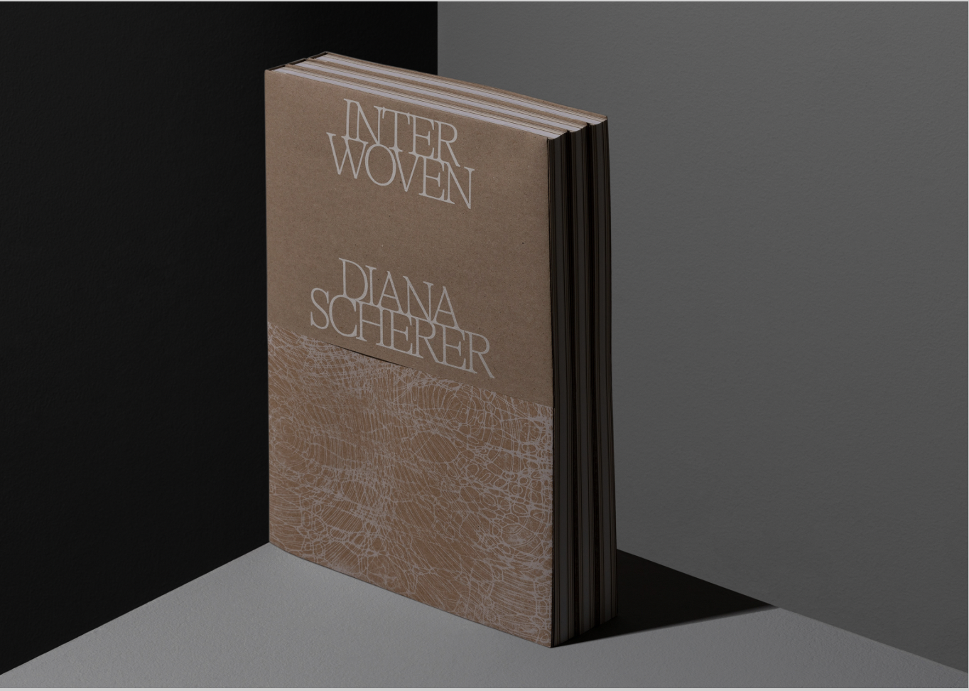
One of my favourite projects was Interwoven, based on Diana Scherer’s root-grown textiles. The book itself reflects the concept, using different paper types and colours to mirror the growth rings of a tree, moving from dark to light and back again. It made me realise how much the physical form of a book can add to the overall idea.
Overall, the visit made me really consider my design process, and maybe how I shoudl really take the time to develop concepts/idea before jumping straight into the design.
I also got some free A2 posters to take home, which were lovely, and are now on my wall in my bedroom!
WEEK 1
Main Studio
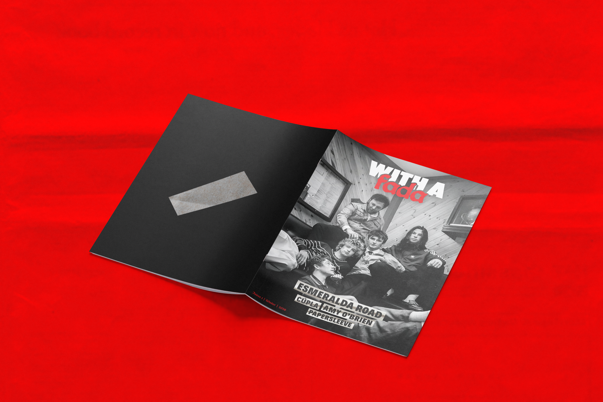
This week, ‘With a Fada’ Magazine held its opening night at Maddens Bar.
This is an independent magazine run by my friend Shannon, sharing the creative talent from all around Ireland. This is a really exciting prospect for the Belfast creative scene, allowing artists to share their work and engage with their community. Hopefully, this will be the start of the beginning of a stronger creative community in Belfast.
The magazine itself showcases interviews, photography, writing, and visual work in an editorial post-punk zine type manner. It is rooted in community and collaboration, having fun through photoshoots, nights out, and honest conversations, providing a space for artists have fun.
Zines have played an important part in the Belfast punk scene, keeping locals up
to date with all the happenings on the scene. Inspired by Mark Perry’s Sniffin’ Glue
and Ripped And Torn, fuelled by the DIY punk ethic, many budding journalists were encouraged to put out their own homemade magazines. A lack of coverage of the punk scene in the established music weekly magazines and papers added fuel to the fire. The fanzines relayed info, gossip and opinion to the local punk scene and were an invaluable tool for many local acts that were totally ignored by the mainland music press. This concept has inspired this new magazine, offering the Belfast creative scene (which is too often ignored) a chance to shine. If there’s room to be involved, I certainly will, it could even be a nice opportunity to highlight graduate work for our end of year show!
WEEK 2
With a Fada
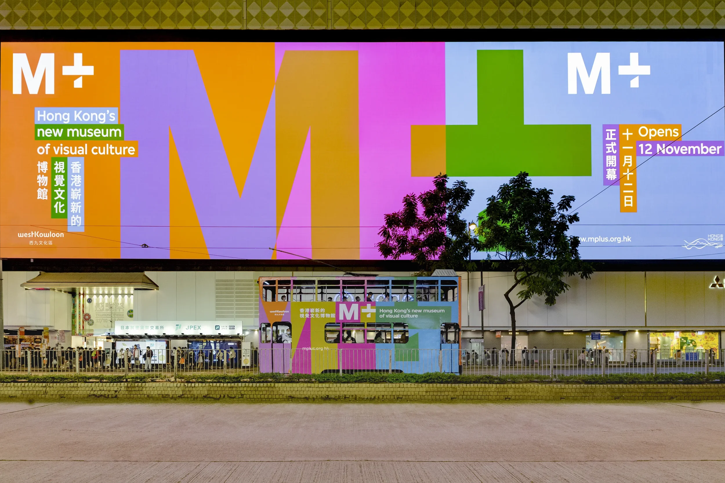
In this week’s Platform session, we had a video call with Studio Thonik – a design studio based in Amsterdam. They gave a really interesting insight into their work across branding, cultural spaces, and large-scale systems. Including projects like Schiphol Airport, Dutch Design Week, and a museum in Hong Kong, showing just how varied their work is.
It was especially enjoyable to hear from a designer originally from NI. Learning about how he ended up in Amsterdam, lived in China, and also made a career in design made me feel quite optimistic about how I could move around the world for my own design career – something that I’ve been contemplating myself!
One area that really stood out to me was their approach to designing for museums, which is an area I find really intriguing. It’s not just about visuals — it’s about creating a clear narrative and helping guide people through information in a way that feels engaging and accessible. Their work for the M+ Museum in Hong Kong showed how design can shape the way people experience and understand content, which was particularly inspiring.
Their branding for Dutch Design Week was also super interesting. It highlighted how important events like Design Week are in shaping and celebrating the design industry. For them, it’s more than just an identity, it represents a whole creative community. The speaker was particularly encouraging about attending design week if you can in Amsterdam, so that has definetely been added to the list.
Overall, the talk made me realise how much I enjoy purposeful design — especially in spaces like museums, where design plays a key role in how people learn and experience things.
WEEK 3
Studio Thonik
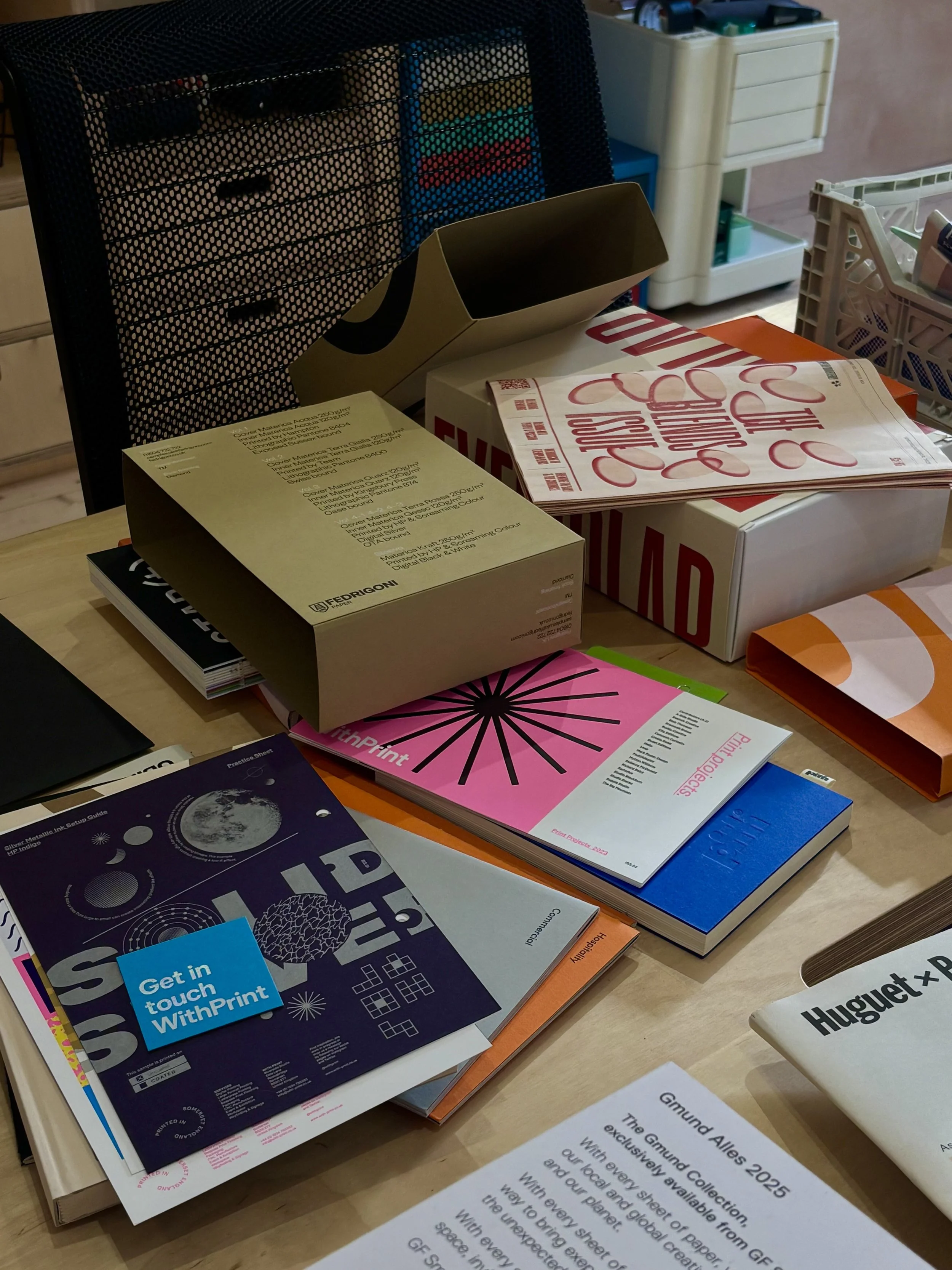
This week, Craig (my mentor) invited my Major Project group to visit Hundred Studio to look through some paper samples. Luckily, he had a huge selection of books and swatches for us to explore. Being able to handle the papers physically was really helpful, as it allowed me to feel the different textures, weights, and finishes in a way that you simply can’t get from looking online. This gave me a much better understanding of the material qualities I might want to use for my ISTD project.
Craig also showed us a range of Fedrigoni paper samples, which was particularly exciting to look through. The variety of colours, textures, and finishes made me think more carefully about how paper choice can influence the tone and feeling of a printed piece. Some of the more textured stocks felt especially relevant to my project, which explores craft, lace-making, and the transition from hand-making to digital systems. Using a tactile or slightly textured paper could help reinforce the idea of traditional craft and materiality, which contrasts with the more digital and computational aspects of the project.
Alongside the paper samples, Craig also shared a lot of helpful information about different printing processes. We discussed techniques such as risograph printing, as well as more specialist finishes like metallic inks and white ink printing. Learning about these processes was really valuable, as my major project is very print-focused, and understanding the possibilities of print production helps shape how I approach the design. For example, processes like risograph could create interesting layering or colour effects, which might work well when visualising patterns or systems within the project.
Overall, the visit was really useful for thinking about the physical outcome of my work. It reminded me that print design is not just about the visual layout on the page, but also about the materials and processes used to produce it. This will definetely help with my major project. But it was also really nice to meet the rest of the team properly! Its good to have more familiar faces amongst the design scene.
WEEK 4
Hundred Studio
This week I’ve been looking into another area of design that I was only really just introduced to; exhibition design (or spatial/environmental design). It’s definitely more niche, but the more I look into it, the more it feels like something I’d like to try!
Working in Hollywood during my placement year, one studio I became aware of was Tandem Design. They specialise in what they call “interpretive design,” creating exhibitions and visitor experiences for museums, heritage sites, and cultural spaces. Their work spans everything from large-scale projects like Titanic Belfast to more local heritage spaces and exhibitions.
For example, on Titanic Belfast, they developed a full graphic system across nine galleries, using colour, infographics, and storytelling to guide visitors through the experience. What I found interesting is how much content they had to manage; thousands of images, panels, and pieces of information — but still make it feel engaging and easy to navigate.
They’ve also worked on projects like the Grand Opera House, where they created interpretive displays, lightboxes, and interactive elements throughout the building, blending history into the physical space. Even in projects like Templemore Baths, they combine storytelling with spatial design, using multi-sensory and interactive elements to bring heritage to life.
What I find really interesting is how this type of design sits between branding and editorial, but expands it into a physical environment. It’s not just about designing something to be looked at, it’s about how people move through a space, what they notice, and how they understand a story over time.
I also like the idea of thinking more spatially; designing something as part of a wider system, rather than a single outcome. Looking back at my 1984 project, I actually really enjoyed thinking about how my brochure could extend into a wider theatre environment, through signage, set elements, and the overall atmosphere.
Overall, this feels like a really exciting area to explore. It combines storytelling, structure, and experience design in a way that pushes beyond print and into something much more immersive. I think because I also kind of view myself as an artist, I like the idea of working in an exhibition space, doing the heavy lifting by making the ‘less interesting’ part of an experience, much more engaging, and flowing with the space itself.
WEEK 5
Tandem
A slightly different this week - in between working on my Major Project,
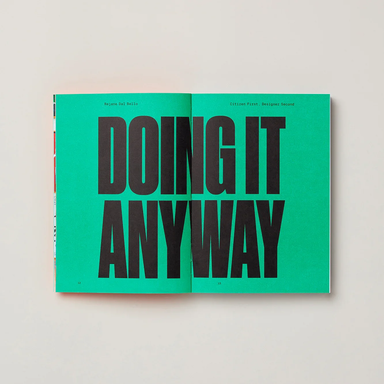
I re-read Citizen First, Designer Second by Rejane Dal Bello.
Dal Bello is a graphic designer and studio owner, now based in London. She has built an impressive career spanning four countries, working with studios such as Studio Dumbar, Wolff Olins, and COLLINS. With over 30 years of experience in branding and design, she has worked at a high level across a wide range of projects.
In the book, she reflects on her journey through the industry, sharing her experiences from early beginnings through to more established work. She doesn’t shy away from discussing missteps and challenges, which makes the book feel honest and relatable. A key theme throughout is the idea of using design meaningfully and with purpose, rather than simply for aesthetics or commercial gain. This is supported by case studies, including her work for the Alzheimer’s Association and her Dr Giraffe project, which both demonstrate how design can be used to create positive social impact.
As a young designer, still relatively new to the working world, I found this perspective really encouraging. It’s reassuring to see that there are designers who prioritise ethics and purpose, and that it is possible to build a successful career without compromising those values, especially in this day and age. Her approach of carefully choosing clients who align with her beliefs is particularly impressive, as it shows a level of control and intention in shaping her own practice that not many feel they can do.
Overall, the book reinforced something I already feel strongly about — that design should do more than just look good. It has the potential to communicate, influence, and contribute to meaningful change, and that’s something that I would like to carry forward into my own design career!
WEEK 6
Rejanne Dal Bello
This week I’ve been thinking a bit more about the kind of work I’m drawn to and where I see myself going as a designer.
I’ve always been really interested in editorial design — particularly how experimental it can be. It often goes beyond simply presenting information, instead capturing a feeling, a sense of movement, or an experience. Lately, I’ve been reflecting on what it is I actually enjoy about editorial, and whether those qualities exist in other areas of design too.
It also feels like the right time to be thinking about this. Editorial opportunities in Ireland are quite limited, which likely means moving abroad if I wanted to pursue it fully — something I’m open to, but also makes me consider how flexible my interests could be.
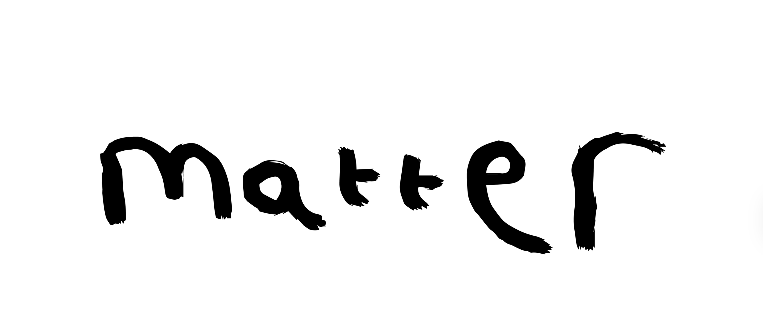
While researching studios whose work I connect with, I came across Extract, a London-based studio working across branding, digital, and editorial. One project that really stood out to me was Matter, a publication created for a charity supporting brain injury survivors.
The publication aimed to showcase the creativity within the community, featuring essays, artwork, short stories, and editorial contributions from members, staff, and volunteers. What I found particularly interesting was how the design reflects this creativity without feeling childish. Elements like the hand-drawn masthead immediately communicate the tone, but the overall execution feels considered and editorial, elevating the work while still keeping it authentic.
What this project really highlighted for me is the importance of storytelling. That feels like the common thread between editorial and branding — and probably the part of design I enjoy most. It’s not necessarily the format that matters, but the ability to communicate something meaningful.
Because of this, I’m starting to realise that I don’t need to limit myself to one discipline. Moving forward, I think I’m more open to branding as a career path, as long as the work still allows for that same level of narrative and intention.
WEEK 7
Extract
“Average is easy. Most follow the path of least resistance… destined to be ignored.”
It’s a bold statement, but after working with clients during my placement year, I can see how true it is. With tight budgets and limited media spend, it often feels safer to choose something familiar and reliable. From a client perspective, that makes sense. But from a creative point of view, its incredibly frustrating, especially when more interesting, unexpected ideas get stripped back into something much more generic.
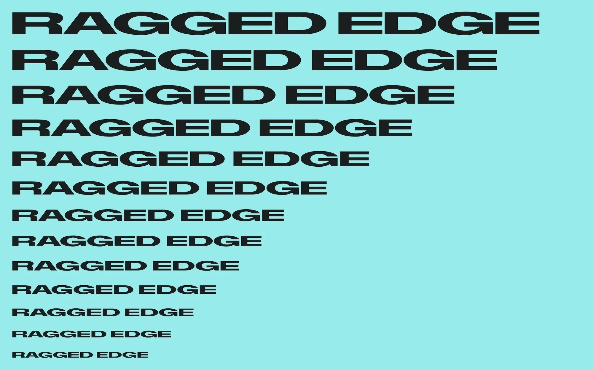
That’s what makes Ragged Edge so interesting. They’ve built their reputation on doing the opposite, creating work that stands out by being deliberately different. Their projects don’t just look distinctive, they’re driven by strong positioning and clear ideas.
What I find most interesting about their work is that it’s not “different for the sake of it.” Everything feels rooted in strategy. Across their projects, there’s a clear focus on brand as behaviour, not just visuals. It’s about how a brand speaks, acts, and shows up in the world, which is why their work feels so cohesive and impactful.
What’s interesting is that because they’ve consistently delivered strong results, their “risk-taking” almost becomes safe. Clients go to them because they want something bold, which completely flips the usual dynamic.
For me, it highlights the importance of backing up creativity with clear thinking. It’s not about being different just to stand out, but about having the confidence — and reasoning — to push ideas further. This is an approach that I’ve tried to take with my final year work, and will continue into my career!
WEEK 8
Ragged Edge